Warehouse Management System (WMS) Modernisation
Modernising key operational workflows in a legacy warehouse platform without disrupting high-volume, time-sensitive work.
- Client
- Unipart Digital
- Team
- 1 product owner, 4 engineers, 2 QA, 3 warehouse operations teams
- Result
- Rolled out across 10 key UK logistics and distribution centres. Component library cut new-workflow build time by roughly half (my own estimate)
Project
Warehouse Management System (WMS) Modernisation
Challenge
A legacy platform had become fragmented, leading to usability friction for warehouse staff who need to perform high-volume tasks with absolute accuracy.
Goal
Modernise key operational workflows and improve clarity without disrupting critical, time-sensitive warehouse operations.
Impact
Supervisors reported fewer mis-picks and quicker task completion on high-volume workflows after launch. This was informal feedback, not a measured result.
Key Design Moves
Discovery: understanding the warehouse floor
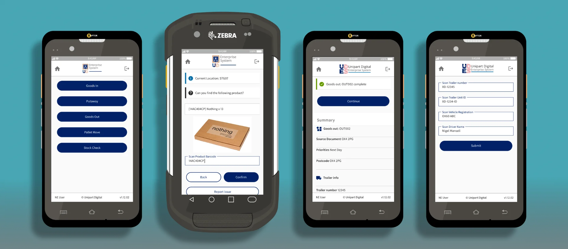
Before touching the interface, I spent four weeks with the people running the warehouse floor: shadowing 15 pickers and packers across three shifts, and structured interviews with six supervisors about where the current system slowed them down. The clearest pattern was that most errors weren't caused by staff misunderstanding the system, but by the interface demanding attention at moments when hands were full or eyes were on stock. That shaped the decision to prioritise high-contrast readability and predictable interaction patterns over adding new functionality. I also walked eight of the core workflows end to end, on the Zebra devices themselves rather than at a desk, and found that the same action required a different number of taps depending on which module a user had come from. That's what led to the modular, reusable component approach described below.
Modernising without disruption
The biggest constraint was the legacy environment, we couldn't just wipe the slate clean. Instead of disruptive changes that would require massive retraining, I focused on incremental improvements. By cleaning up navigation and standardising feedback, we reduced friction while keeping the system familiar enough that daily warehouse operations weren't interrupted.
Solving for high-pressure environments
Warehouse users aren't browsing; they are executing. I mapped the end-to-end workflows to find where the process introduced unnecessary friction, duplicated steps, unclear feedback, or bad hierarchy. We re-structured these to prioritise task progression, making the interface a tool that helps them work faster rather than a barrier they have to navigate around.
Making accessibility a functional requirement
In a warehouse, accessibility isn't just about compliance, it's about usability. We focused on high-contrast readability, clearer visual hierarchy, and more predictable interaction patterns. This wasn't just "cleaning up the UI"; it was about ensuring that under high-pressure conditions, the right information is always the easiest thing to see and act on.
Scaling for the future
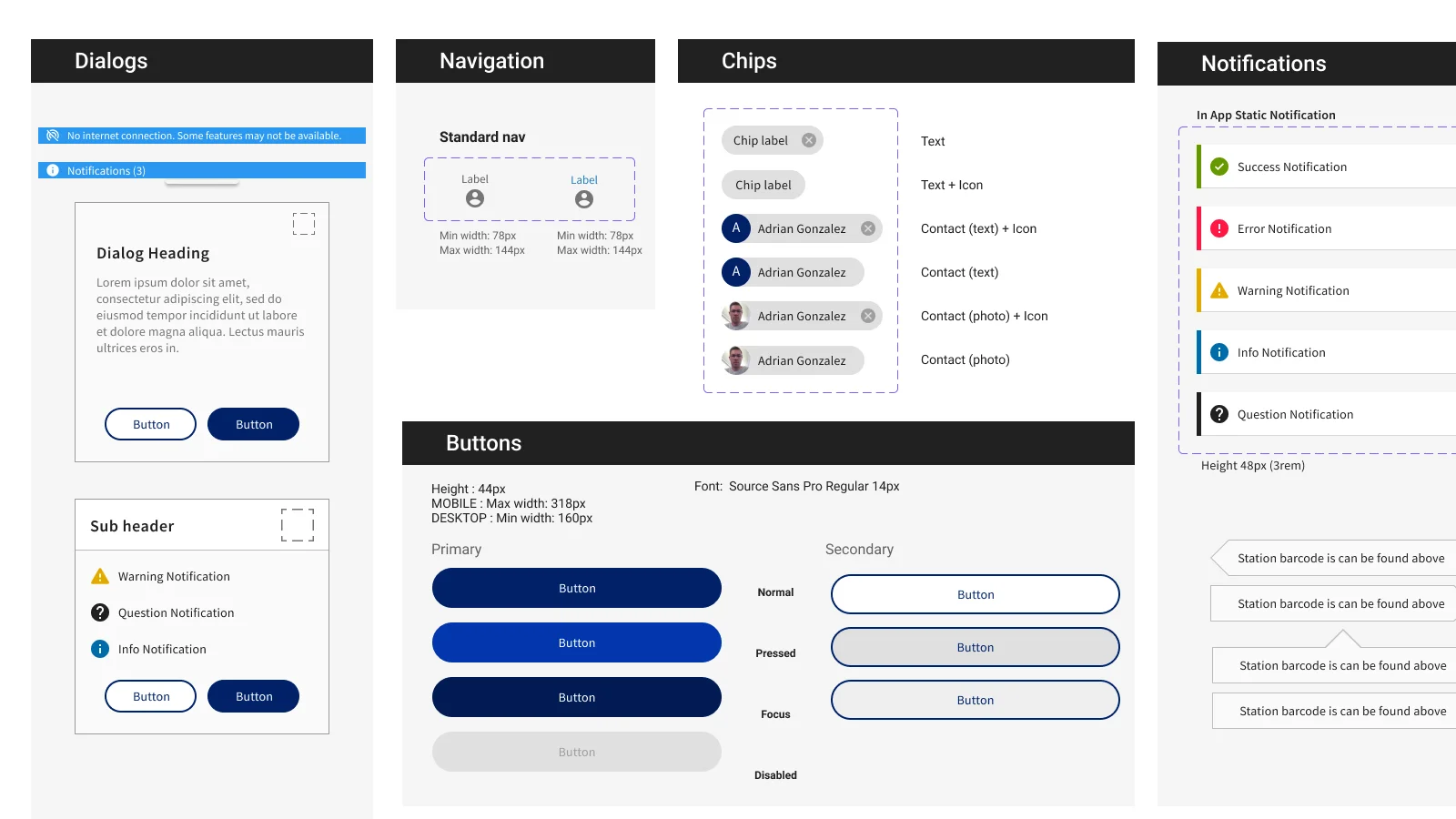
We were building on top of legacy architecture, but I pushed for a modular approach. By introducing reusable patterns and a consistent UI structure, we moved away from one-off fixes. This means the next time the business needs a new workflow, they don't have to build it from scratch, they can use the standard components we established.
Gallery
Design System Upgrade
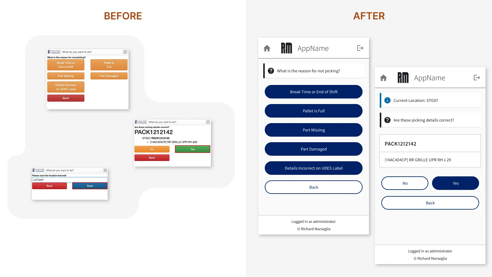
- Before: Fragmented UI: Bespoke components increased development overhead and created inconsistent user patterns.
- After: Unified Design System: Reusable components reduced design debt and ensured consistent interaction patterns across the platform.
Cleaner, More Accessible UI
- Before: High-Density Overload: Lack of visual hierarchy made it difficult for users to distinguish primary actions from system noise.
- After: Contextual Clarity: Implemented improved visual hierarchy and contrast, allowing users to identify critical operational data at a glance.