Parent-Focused Travel Card Spending Experience
A simple, trustworthy mobile experience helping parents monitor spending while giving younger travellers independence abroad.
- Client
- Thomas Cook Money
- Team
- 1 product owner, 1 delivery team, 2 stakeholders, 1 delivery manager
- Result
- Tested with six parent and child pairs. Ended at prototype stage when the company ceased trading
Project
Parent-Focused Travel Card Spending Experience
Challenge
Parents lacked real-time visibility into their teenager's spending abroad, leading to anxiety over unmonitored balances and unexpected fees or card blockages.
Goal
Design a clear, stress-free spending experience that gave parents instant transparency without restricting the young traveller's independence.
Impact
Testing supported two patterns: real-time spending visibility, and check-ins triggered by transaction notifications.
Key Design Moves
Discovery: understanding parent concerns
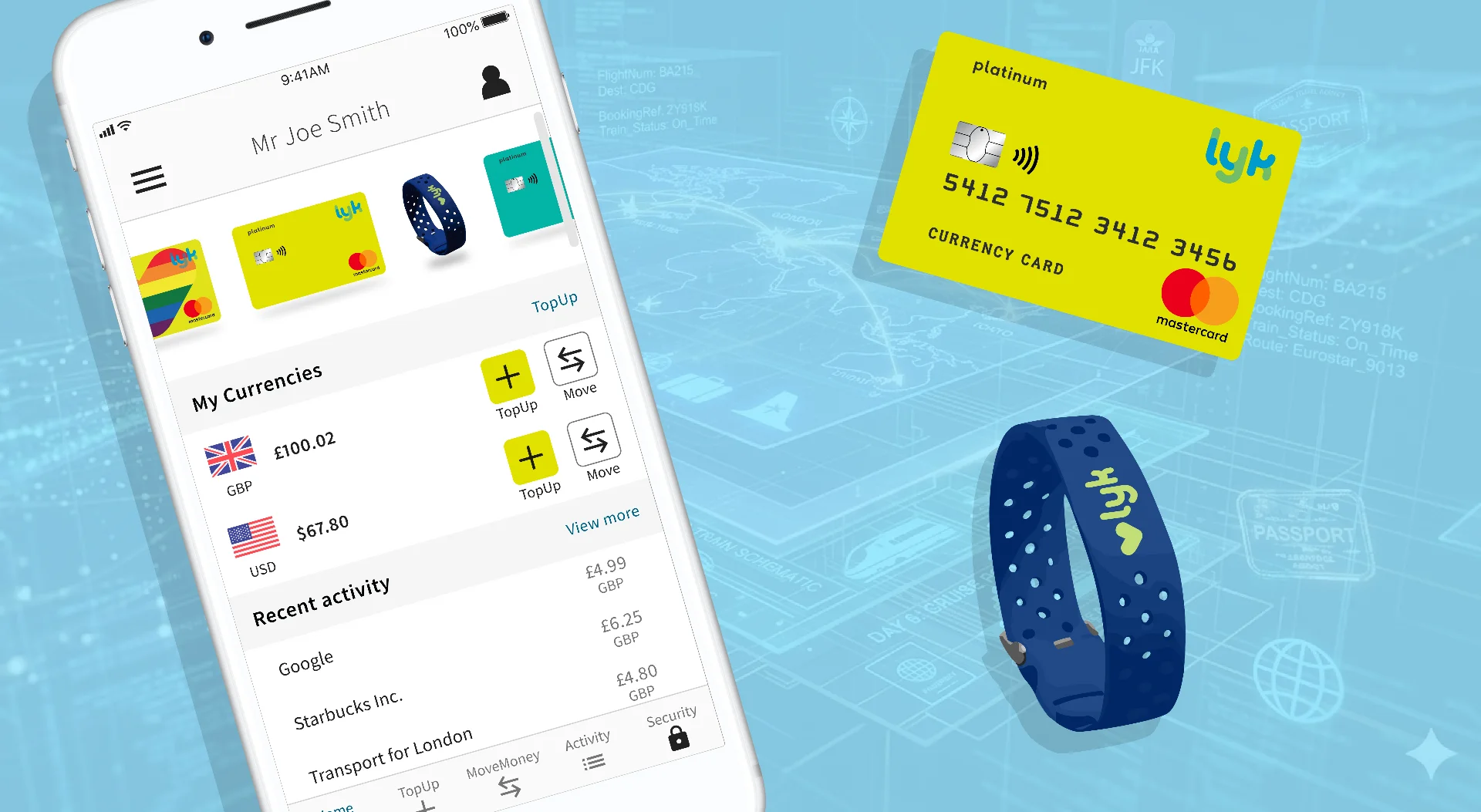
Before defining the experience, I needed to understand what actually made parents anxious about their child spending abroad, rather than assume it. This meant interviews with multiple parents of teenagers who'd travelled independently, plus a review of customer feedback and competitor reviews for five competing travel card products. The clearest pattern was that parents weren't primarily worried about overspending itself, they were worried about not finding out until it was too late to do anything about it. That's the insight that shaped the decision to prioritise real-time visibility and progressive disclosure over hard spending caps. Reviewing the end-to-end user journeys showed that most interaction happened reactively, right after a transaction notification, rather than through proactive app checks. That's what shaped the emphasis on at-a-glance clarity and rapid status updates in the interface below.
User & Market Research
Reviewed competitor products and existing financial management experiences to understand how families interacted with spending controls and transaction visibility. Explored common concerns around: overspending abroad, transaction visibility, ease of monitoring, financial trust, simplicity during travel. This research helped identify the importance of clarity, reassurance, and low-friction interaction patterns.
Experience Definition & User Flows
Defined user flows that allowed parents to: monitor spending activity, review balances and transactions, manage card usage, quickly understand spending behaviour. Focused on reducing unnecessary complexity and ensuring key information could be understood at a glance.
Interface Design & Visual Consistency
Designed a clean, approachable interface aligned with Thomas Cook’s existing brand language and customer expectations. Visual decisions prioritised: familiarity, readability, trust, clarity of financial information. The interface aimed to feel supportive and easy to navigate rather than overly corporate or banking-focused.
Prototyping & Iteration
Created interactive prototypes to validate navigation patterns, hierarchy, and transaction visibility. Iterated on layouts and interaction flows to simplify key actions and ensure the experience remained intuitive across different usage scenarios.
Decisions & rationale
A major focus of the project was reducing perceived complexity. Financial products can easily become overwhelming when too much information competes for attention, especially within travel contexts where users may already feel uncertain or stressed. Rather than exposing large amounts of transactional data upfront, the experience prioritised: progressive disclosure, clear hierarchy, concise feedback, familiar interaction patterns. This was intended to create a calmer, more confidence-building experience for parents, an approach early testing supported before the project was discontinued.
Outcome & impact
Early prototyping and usability testing pointed to a more user-friendly, family-oriented extension of the Lyk card experience, though the project didn't progress beyond this stage before the company ceased trading. What testing validated: clearer spending visibility for parents, simplified navigation and interaction flows, stronger alignment with Thomas Cook’s brand experience, and early signs of improved trust and usability with the parent-child pairs tested. The direction pointed toward expanding the product experience beyond simple payments into a more supportive travel companion for families, had the project continued.
Validated in testing
Spending Visibility
Simplified
Navigation & Flows
Early signs
Parental trust
Reflection
This project reinforced how important emotional context is within financial UX. Designing for trust is not only about security and functionality, it’s also about helping users feel informed, confident, and in control without overwhelming them with complexity. It also highlighted the importance of balancing oversight with independence when designing products used by both parents and younger travellers.