Scalable Integration Workflows for Enterprise SaaS
Simplifying complex integration management across APIs, file transfer systems, and administrative workflows within an enterprise SaaS platform.
- Client
- Epicor
- Team
- 1 product owner, 1 delivery team, 7 stakeholders
- Result
- Standardised skeleton reused for 4 new connector types without a redesign
Project
Integration Management Platform
Challenge
Fragmented workflows across APIs and connectors led to operational friction and inconsistent user feedback.
Goal
Architect a scalable operational framework to simplify configuration, monitoring, and troubleshooting.
Impact
Support teams reported fewer escalations tied to unclear error states, and new connector types are now built on the standardised skeleton instead of bespoke setup flows.
Key Design Moves
Discovery: understanding the fragmentation
Before designing anything, I spent six weeks talking directly to the people dealing with the fragmented workflows day to day: contextual interviews with 12 support engineers and eight customer-facing account managers, plus a review of four months of integration-related support tickets. The clearest pattern was that most escalations weren't caused by integrations failing, but by users being unable to tell whether the failure was theirs or the system's. That insight shaped a later decision to redesign error messaging around "here's how to fix it" rather than a generic failure state. I also mapped the existing setup flow for seven integration types end to end, and found that OAuth and FTP setups shared almost none of the same UI patterns despite solving the same problem for the user. That finding led directly to the standardised skeleton described below.
From messy workflows to a shared language
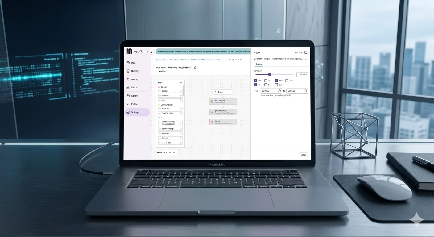
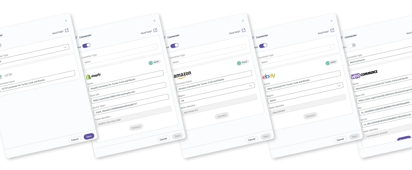
The platform had grown organically, which meant every integration type (FTP, OAuth, etc.) felt like a different product. I spent time with our support and engineering teams to map these out. Instead of building unique flows for every new connector, I created a "standardised skeleton", a unified structure for setup, monitoring, and errors. This didn’t just make the UI feel consistent; it cut down development time for the team.
Making complex tech feel approachable
We had to balance high-level technical power with ease of use. My approach was to strip away the noise. I organised the interface so that common tasks are front-and-center, while the advanced "power user" settings are tucked away until they are actually needed. It’s about keeping the interface clean without dumbing down the functionality.
Turning error messages into actionable insights
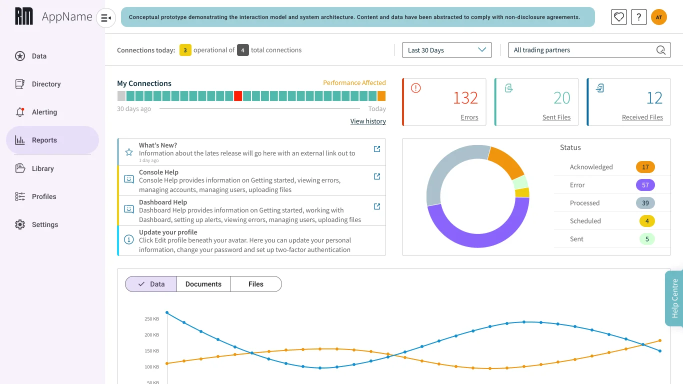
Users were struggling to understand if an error was on their end or the system’s end. I redesigned the dashboard to explicitly differentiate between a communication failure and a user input error. By giving the user more transparency, we moved from "What happened?" to "Here is how to fix it," which reduced the load on our support team.
Building for growth, not just for the sprint
As the integration ecosystem expanded, I realized we couldn't keep designing bespoke patterns for every new feature. I pushed for a more modular, component-based approach to our workflows. By standardising these building blocks, we've created a system that can scale without requiring a total redesign every time a new API type is added.
Gallery
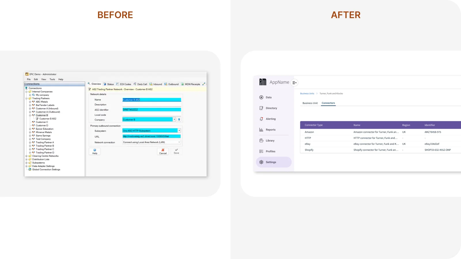
Reframing connector management
- Before: A dense, legacy tree-view forced users to drill through nested menus to manage trading partners and connections.
- After: A focused settings surface with a clear Business Unit context and a tabular Connectors view that makes status and identifiers scannable.
Simplifying setup and workflow logic
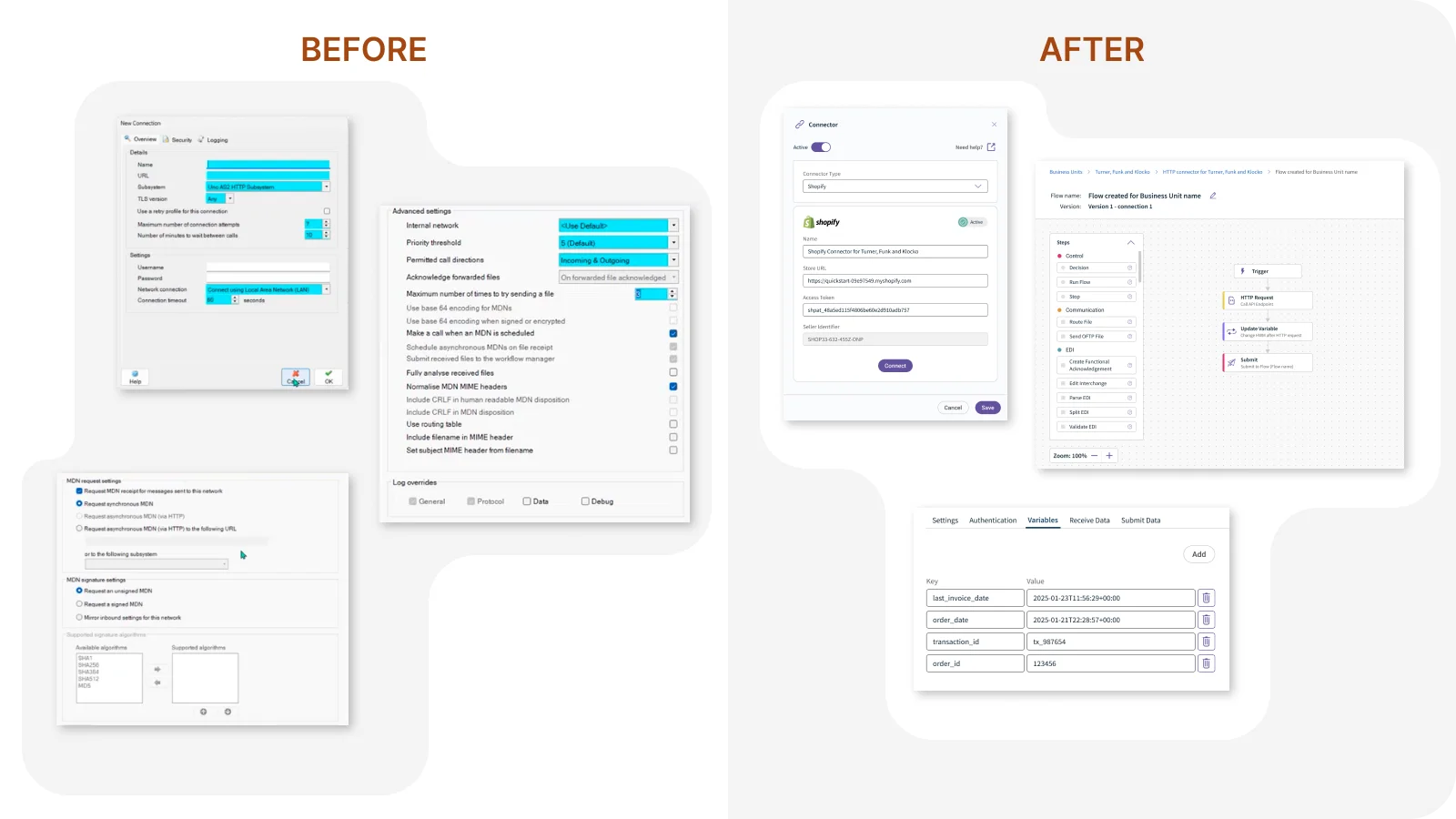
- Before: Connection setup was spread across multiple cluttered dialogs mixing required fields, advanced toggles, and signature options in one view.
- After: A guided connector panel pairs essential fields with a visual flow builder, surfacing variables and steps without exposing low-level protocol noise.